


Complementary colors as a tool for designers
Choose shades like a professional. Interested in color design? Read this article for good tips on using complementary colors and how light affects colors. Yes, we see colors individually.
Color is not decoration – it is structure
Colors are not just a surface solution in interior design, but a built part of architecture and spatial experience.
Complementary colors, that is, the colors located on opposite sides of the color wheel, are a particularly effective tool – they bring rhythm, energy, and optical depth to a space, just like a structural tendon in a bridge. The color wheel makes it easy to understand complementary colors.

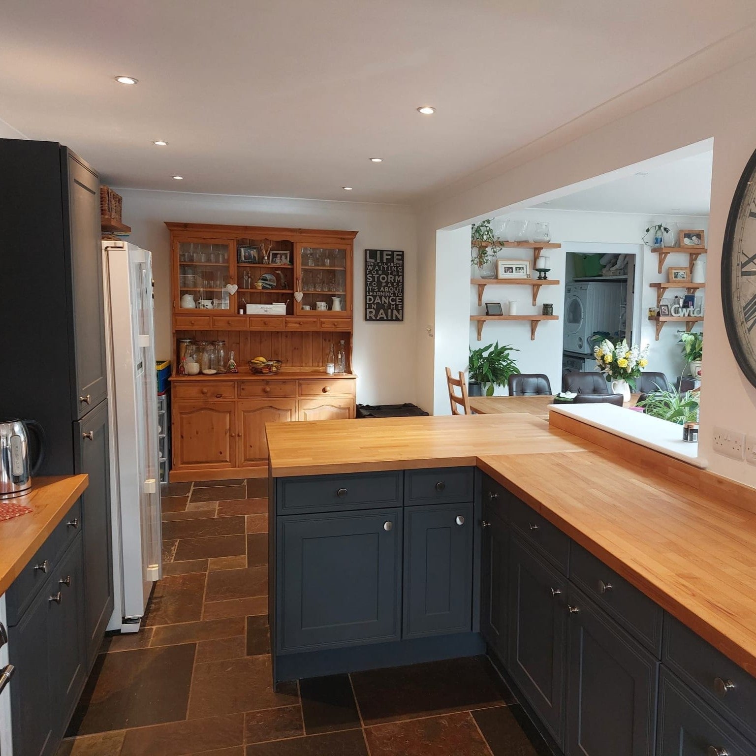
With Frenchic paints, complementary colors do not clash – they converse. Sometimes introducing a new color into a space makes other colors come alive. Complementary colors are noticed and always evoke emotions.
A soft velvety matte surface scatters light and brings contrast to life naturally as part of the interior. The result is a harmonious space with both technical and emotional balance.

Engineer facts about colors and color vision – the physics of contrast
The functionality of complementary colors is based on eye physiology and light wavelengths.
When two wavelengths far apart (e.g., blue ~470 nm and orange ~600 nm) are placed side by side, maximum spectral contrast is created – it makes the brain interpret the space as brighter or deeper.
Yes, every person sees colors differently because personal factors such as genetic differences, gender, and color blindness affect color vision.Although the basic mechanism is the same, the brain's way of interpreting signals sent by the eye's cone cells varies individually.
In interior design, this is technically reflected in the following metrics:
-
LRV (Light Reflectance Value): indicates how much light is reflected from the surface.
-
A light shade, like Stone Rosie (LRV ~58), reflects more and opens up the space.
-
A dark shade, like Smudge (LRV ~8), absorbs light and creates an intimate atmosphere.
When these are combined, an optical depth effect is created – the space gains rhythm and contrast that works in all lighting conditions. -
Contrast ratio: a good interior contrast is typically 5:1 – 8:1, where shades stand out but do not disturb. So boldly choose that shade, because all shades lighten on large surfaces.
-
Color temperature and spectral change: the difference between daylight (5500 K) and warm artificial light (2700–4000 K) directly affects how complementary colors appear. Therefore, shades should be tested at different times of the day. Peel & Stick color sheets with adhesive surfaces help with selection and are easy to move from room to room at different times of day.
Color architecture – the dialogue of light and surface
In architectural design, color is part of the building's material palette, not just an added decoration. Color determines how light behaves in a space: whether it is absorbed, reflected, or blends with other shades.
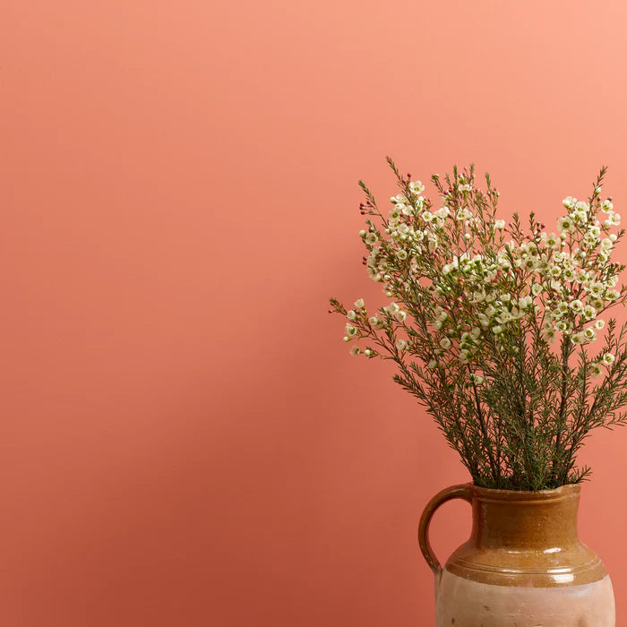
For example, a room painted with a delicate light pink wall paint feels like it bathes in morning sun all year round. Explore pastel shades like Pinky and Sweetcheeks.
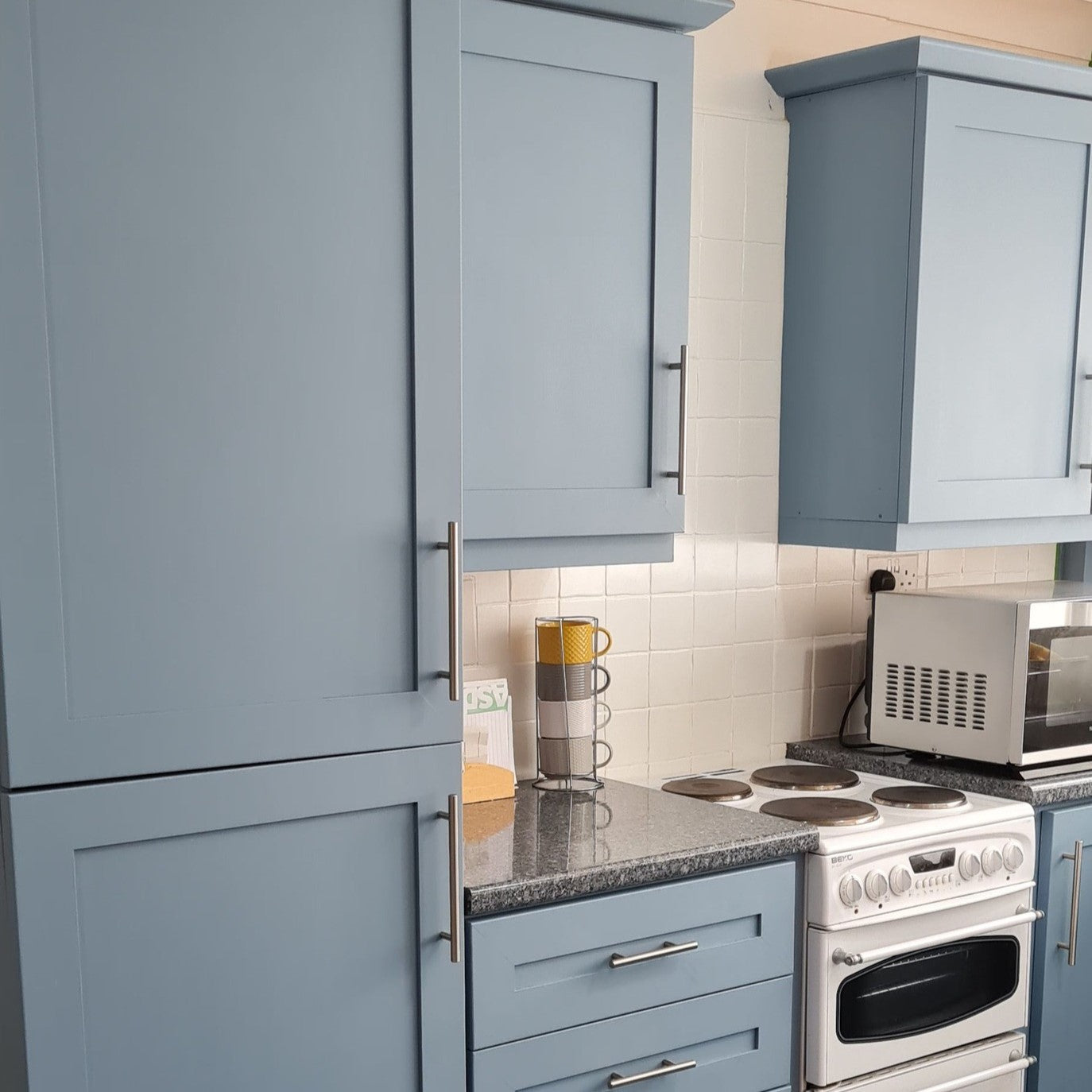
Frenchic paints work excellently in this context – their surface is matte, so light does not reflect back as a shiny glare but spreads softly. This makes complementary color contrasts natural and long-lasting also in different seasons. Our ultra-matte wall paint is especially beautiful.
Historical examples of masters of color structure
Le Corbusier's color philosophy
Swiss architect Le Corbusier created the Architectural Polychromy system in the 1930s, dividing colors according to spatial effect: deepening, lightening, harmonizing, and accentuating.
He used complementary color pairs – like warm oranges against cool blue – deliberately as a structural element, not as decoration.
Alvar Aalto and colors in Finnish light
In Paimio Sanatorium (1933), Aalto used the complementary color principle functionally: blue and greenish shades calmed, while warm yellows, greens, and terracottas enlivened communal spaces.
Finnish light is cool and diffused, so Aalto's colors were not pure but muted complementary colors towards natural light – an excellent lesson for today's painting projects. Interestingly, the color of interior ceilings was also important.
Using complementary colors in interior design – create a technical yet emotional space
The complementary color pair works best when contrast is adjusted through materials and textures.
Try the following Frenchic combinations:
| Primary color | Complementary color | Design impact | |
|---|---|---|---|
| Stone Rosie | Smudge | Harmonious contrast, warmth + depth | |
| Honeycombe | Duckling | Dynamic yet bright combination | |
| Steel Teal | Macaroon | Cool-warm dialogue, calming yet modern | |
| Blackjack | Dazzle Me! | Maximum contrast, graphic impression |
Professional tip: Use one strong complementary color as an “accent” (e.g., door, furniture, or ceiling) and keep other surfaces more neutral. This way, the space remains visually calm but impactful.
Color psychology and user experience
Studies show that color contrasts can even affect comfort of use and energy consumption of a space.
With complementary colors, it is possible to:
-
increases depth perception without structural changes
-
optimizes light reflectivity (less need for artificial lighting)
-
improves spatial orientation – for example, in hospitals and schools, complementary colors help with navigation and distinguishing functional areas
Frenchic paints create a contrast that is a sensible and aesthetic choice – less need for repairs, more control of light. You can thus use colors to highlight or hide - stretch or widen the sense of space. Only with colors do you create the atmosphere in a space!

Finally – color is engineering and emotion
The use of complementary colors combines precision and emotion.
When the contrast and reflectivity of shades are calculated correctly, the space transforms into an experience:
light moves, surfaces breathe, and architecture begins to resonate.
Frenchic offers shades where architectural color intelligence and home warmth meet – equally for professionals and bold home painters. So bring emotion into your design!
Complementary colors – the art of contrast and the rhythm of home
When color becomes experience
Complementary colors are a fundamental element of interior design that can control the rhythm, energy, and eye flow of a space. They are like the harmony of two different notes – tension and balance in the same space. It is precisely the use of complementary colors that easily makes a space interesting and inviting.
With Frenchic paints, complementary colors do not shout but breathe subtly. The matte, velvety surface absorbs and diffuses light so that contrasts blend naturally into the space – just like architectural shadow play. The velvety smooth surface is both timeless and luxurious and gives a calm impression.
Opposite magnets of the color wheel
Complementary colors are shades located on opposite sides of the color wheel that neutralize and enhance each other.
When these colors meet, a contrast dynamic is created that brings depth and rhythm to the space.


Classic complementary color pairs in interior design are:
-
Blue and orange – the perfect balance of cool and warm.
-
Red and green – a natural contrast also found in the plant kingdom.
-
Yellow and purple – a bold, creative, and energizing combination.
With muted shades, such as Frenchic paint colorsyou can control contrast without excessive visual noise – an important skill especially in small spaces and areas with limited natural light. Remember, you can also use light pastels as complementary colors – interior colors don't always have to be strong.
A professional perspective: optical balance
In interior design, choosing complementary colors is not just about pleasing aesthetics – it is a dialogue between light and surface.
Professionals often talk about LRV value (Light Reflectance Value), which indicates how much light a color reflects or absorbs.
Info: LRV (Light Reflectance Value)is the surface's ability to reflect light measured in percentages: 0% is completely black and 100% completely white.High LRV means the surface reflects more light and appears lighter, while low LRV means the surface absorbs more light and appears darker.LRV is often measured with a spectrophotometer, and its value depends not only on the color of the surface but also on its texture and gloss level.
The strength of contrast also depends on the direction of light and color temperature (Kelvin): cool northern light emphasizes blue hues, while spaces opening to the south warm up with orange and reddish tones. Naturally, we have different shades of natural light available in different seasons. It is both a challenge and a wonderful opportunity! The heart of winter's "blue moment" must be experienced!
Material, light, and color pairs - color is light
A professional-favored way to handle complementary colors is through the material palette: colors are not just surfaces, but also texture, gloss, and light reflection.
For example, Frenchic's ultra-matte wall paint absorbs, that is, soaks up light and gives contrasts a natural depth - while providing a durable and fully washable surface for everyday use. Matte and breathable Frenchic wall paints are the perfect choice for example in traditional buildings, together with wainscoting or paper wallpaper due to their technical properties, but also because of the powdery and muted traditional shade selection.
The value of a color is its degree of darkness or lightness
It describes how dark or light a hue is, and is one of the three basic properties of color alongside hue and saturation. Good use of values is important in art and spatial design, as it creates the base and structure for the space (or art), and colors can then complement the expression.
- hue: color's position in the spectrum
- saturation: intensity of color
- value: degree of darkness
Uses and meanings
- Mood and atmosphere:
-
LRV can affect the atmosphere of a space;for example, higher values create a more open and brighter impression.
Measuring the LRV value.
Contrast and accessibility:The difference in the LRV value of a color is critical to perceive visual differences, for example, between doors, floors, and walls.The recommendation is at least a 30-point difference to make the space easier to navigate, which is especially important for the visually impaired.
In design and architecture:Professionals use LRV values to predict how light or dark a surface will appear and how it affects the overall look of the space.
Boldly, but with control
Using complementary colors requires understanding but always rewards. A good designer balances saturation, light, and surface texture so that the result feels authentic and deliberate.
"Complementary colors do not compete. They complement each other – like light and shadow in architecture."
Choose Frenchic – colors that stand the test of time
The Frenchic paint series offers professional-grade pigments and an ecological composition that perfectly reproduce the harmony of complementary colors.
Whether it's a color contrast for a modern loft or a traditional wooden house, Frenchic shades offer depth, texture, and emotion – exactly what designers and decorators appreciate.Color psychological tension – when the space begins to live
From the perspective of color psychology, complementary colors activate different brain hemispheres and create emotional kinetic energy in the space.
Blue–orange brings energy and creative focus to workspaces.
Red–green balances stimulation and calmness in the dining area.
Yellow–purple attracts community and inspiration – perfect for the living room or a creative studio.
The natural pigment base of Frenchic shades makes the color psychological effect softer and longer-lasting – they don't tire or irritate, but blend into the rhythm of living. The beautifully smoothing wall paints have a velvety surface that is understated and stylish.
If you have a color plan for the space in your plans, use the Color Wheel to check complementary colors and shade compatibilities. The easy-to-use color wheel is double-sided.
Here you can read the instructions for using the color wheel.
Whether you choose your color with emotion or science, the most important thing is that you choose that color. With Frenchic, you'll learn to be bold with color!