Warm Your Home with the Season's Trendiest Shade – Enchanting Burgundy - a lovely wine red

Autumn has arrived, and what better way to bring warmth and elegance to your home than by choosing this season's trendiest shade: burgundy.
But what can be combined with it and what can't?
Read this blog for tips on how to use the hottest shade in interior design correctly.
This deep, rich wine-red shade is the perfect choice for autumn decor, as it exudes comfort, sophistication, and a touch of luxury.
Do you choose the bearberry wine-red shade, the dark eggplant shade, or an almost brown one with a hint of strong red wine essence?
Burgundy is a color that brings much-needed warmth to the home on cooling days and evenings.
The History of the Burgundy Shade
Burgundy is a shade with a rich and multifaceted history. The name "burgundy" traces its roots to the French Burgundy region, which was known for its wine cultivation and significant historical achievements.
This deep red shade was especially popular among European nobility in the Middle Ages, symbolizing power, wealth, and sophistication.
During the Renaissance, burgundy was a luxurious color used in art and fashion elements.
Many famous artists, such as Botticelli and Michelangelo, used burgundy shades in their paintings to create depth and dramatic contrasts.
This color was also popular in royal attire, which reinforced its status as a noble and esteemed shade.
In the 1700s and 1800s, burgundy continued its popularity especially in interior design and architecture.
It was often chosen as colors for wallpapers, furniture, and textiles because it brought warmth and elegance to spaces. In the early 1900s, the use of burgundy shades expanded into art and fashion, maintaining its status as a classic and timeless color.
Today, burgundy remains a popular choice in both interior design and fashion. Its timeless charm and versatility make it a perfect choice for both traditional and modern interior styles.
Burgundy is a color that connects the past and present, bringing a touch of history and enduring elegance to the home.
The Magic of Burgundy – depth and warmth for your home
The burgundy and wine red shade offers perfect balance for autumn: it is both bold and inviting.

This elegant and intense shade of red brings depth and intensity to the space, while radiating cozy warmth.
It is the perfect choice for you who want to bring a luxurious and deep shade into your home without making the space feel too heavy or dark.
Whether your interior style is modern, bohemian, or classic, burgundy works excellently both as a main color and as an accent.

This color is ideal for adding sophistication to the living room, bedroom, or even the dining area, where its deep shade creates an inviting atmosphere.
A harmonious combination – Burgundy and neutral colors
One of burgundy's strengths is its ability to blend seamlessly with neutral shades.
Soft neutrals like beige, cream white, or gray are perfect companions for burgundy. This combination adds depth to the decor and ensures the overall look remains balanced and stylish.
If you don't want to paint the entire room burgundy, you can use it as subtle accents alongside more neutral shades.
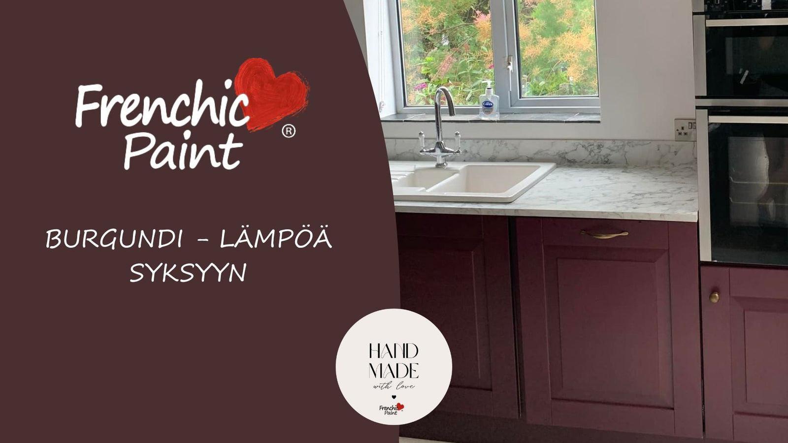
Try Boho Berry and Boujee shades combined with soft background colors, like grays Shush, Swankypants, Spitfire or light Ballerina, Marshmallow, Parchment and Stone Rosie, to create the perfect contrast and a deep, warm atmosphere.
Create layering with textiles and materials
Burgundy shades truly come to life when combined with soft, richly textured materials.

Try adding velvet cushions, luxurious wool blankets, and plush rugs that highlight the depth and warmth of burgundy.
This way you create layering in the space, making the interior even more attractive and cozy.
When burgundy shades are combined with natural materials like wood or metals such as silver, brass, or copper, the result is a sophisticated and timeless look.
The warmth of dark wood emphasizes the intensity of burgundy, while lighter wood types like oak bring lightness and freshness to the space.
Burgundy as an accent color – A small touch of elegance

If you want to add just a small touch of burgundy or eggplant shades to the space – these shades also work excellently as accent colors.
You can highlight burgundy shades by painting individual furniture pieces, frames, or even an accent wall.
Small details like burgundy-colored pillows, curtains, or candles add just the right amount of warmth and depth to the space without the color dominating too much.
Bringing burgundy shades into the interior through velvet cushions, curtains, or throws makes the space luxurious and cozy – a perfect way to bring autumn into your home.
Get inspired by the autumn atmosphere – combinations of burgundy and natural tones
Natural shades and burgundy together form perfect harmony.
Try combining burgundy with earthy colors like terracotta or natural wood tones. This combination brings warmth and grounding atmosphere to the home, making the space even more inviting.
Burgundy and natural materials like wool and linen complement each other, creating a balanced and calm environment.
Dark brown and burgundy highlight each other's rich tones, and for example, Liquorice shades can complement the autumn atmosphere.
Pre-selected shades with Boho Berry and Boujee tones are:
Rosy Dusky, Steaming Green, Olivia, Honeycombe, Earthy and Liquorice.
Color theory – a brief guide: How to stylishly combine burgundy
Burgundy is an incredibly versatile color, but combining it correctly can take your interior to the next level.
Colors That Match Perfectly with Burgundy:
1. Neutral Shades
- Beige and Cream White
- Gray and Greige
2. Earthy Colors:
- Terracotta and Clay Shades
- Brown and Dark Wood Tones
3. Metallic Combinations:
- Gold and Brass
- Copper
Colors Not Recommended to Combine with Burgundy:
1. Too Bright Shades: for example neon colors like neon green or neon orange.
2. Bright Red: can create a competing effect with burgundy.
3. Too Cool Shades: like bright blue.
And of course - these instructions are just guidelines meant to be modified, broken, and improved - exactly according to your own color preferences - so test away! Combine colors boldly and find the best shade combinations from the forbidden ones - make personal choices, just for you.
Want to learn more about colors? Read more about green.
