
When choosing wall paint, it's easy to fall in love with a small sample from the color chart or a stunning photo in an interior design magazine. However, the truth is that the same shade can look completely different at home. One of the biggest reasons for this is lighting. Both natural and artificial light significantly change how our eyes perceive colors.
This blog explains why lighting is such an important part of paint selection, how different light sources affect the shade of wall paint, and what to consider before making the final decision.

Natural light – daylight constantly changes color
Natural light is the strongest single factor that determines how a color looks on the wall.
-
Morning light: especially in rooms facing north, the light is bluish and cold. For this reason, for example, a light gray can appear blue.
-
Midday light: in spaces facing south, shades appear warmer and brighter. Beige can look almost cream white and green even fresher.
-
Evening light: as the sun sets, the light takes on golden and orange hues. At this time, for example, white walls can shift toward yellowish and reddish tones.
👉 In practice, this means the same painted surface can look like one shade in the morning and completely different in the evening.
Artificial light – the type of lamp matters
In addition to natural light, artificial light plays a key role, especially in winter and evenings. The color temperature of the light determines a lot:
-
Warm-toned lamps (2700K): create a cozy atmosphere but can make cool colors (e.g., blue or gray) look dull or greenish. On the other hand, warm colors like terracotta or beige appear soft and beautiful.
-
Cool-toned lamps (4000–6000K): bring out cool colors such as white, gray, and blue. Warm tones, however, can become overly yellowish or even unpleasantly orange.
-
Neutral light (3000–3500K): a good compromise if you want to see colors as close to natural as possible. This is especially suitable when the space has many different shades.
Colors and lighting – practical examples
-
White shades: neutral white easily turns yellowish in warm light and bluish in cold light. So it’s worth carefully choosing whether you want a warm or cool atmosphere.
-
Gray shades: gray is often a tricky color because it absorbs surrounding colors. Northern light brings out bluish nuances, while warm evening light makes it lean toward brown.
-
Blue shades: in cool light, bright and fresh shades stand out, but in warm light, blue can look greenish.
-
Green shades: in daylight, green is often fresh and balanced, but under artificial light, it can shift toward yellow or blue depending on the lamp type.
Room purpose and lighting
Lighting should also be adapted to the room’s purpose.
-
Living room: warm lighting combined with earthy tones creates a cozy atmosphere.
-
Office: neutral or slightly cool light combined with clear, cool shades improves concentration.
-
Bedroom: soft light and muted shades calm and make the space peaceful.
-
Bathroom: bright lights and often cool shades can make the space modern and fresh, but dark paint stands out dramatically.

Practical tips for choosing the right shade
-
Always test with samples – paint an A4-sized area or use a removable test painting board. The movable and adhesive Peel & Stick A5 size color sheet is perfect for choosing a shade.
-
Look at the color at different times of day – you’ll quickly notice how light changes the shade.
-
Use the right lamps already during testing – test the painted surface with the lighting you plan to use.
-
Consider the surroundings of surfaces – floors, furniture, and textiles affect how the color looks when light hits them. For example, an orange pine ceiling or floor can reflect reddish tones onto light and white shades.
-
Avoid relying solely on color charts – a paper printed sample never looks exactly the same as paint on a real surface or color charts and shade samples made from actual paint, like those in the Frenchic series. The A5 Peel & Stick color sample makes shade selection easier. The back of the sheet has a handy adhesive surface, so you can easily move the sheet according to the light. The recommendation is to look at at least two color sheets at the same time.

Key factors for your space’s atmosphere – velvety and stylish
Frenchic wall paints have a gloss level of only 5%, so the surface becomes wonderfully velvety, understated, and stylish. Our ultra-matte wall paint provides an exceptionally calm and timeless atmosphere, whether your space is at home or in a business.
Start by deciding what kind of atmosphere you want to create in the space. Then choose at least three or preferably five shades that give the desired mood. Test these shades exactly in the space and on the surface where you plan to use them.
Choose shades boldly according to your own preference: for example, a delicate and light pink wall paint brings a stunning and soft shade to the entire space – like a beautiful morning sun filling the whole room!
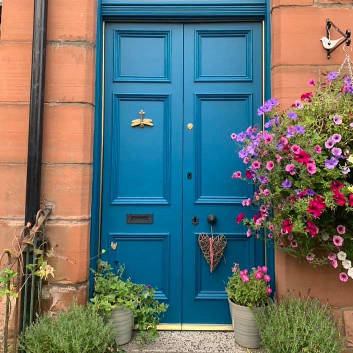
Mediterranean terracotta fits well in Finnish spaces. The beautiful red clay shade is at its best in the evening sun.
Frenchic white shades are not tinted with black, so they lack that slightly dirty 'painter’s white' tone. The pure white Whitey White wall paint is excellent, for example, for painting yellowed and darkened wooden paneled ceilings.
Lighting can make white look yellow, gray look blue, and blue look greenish. That’s why just looking at a color chart is not enough; the color must always be tested in a real space and under the right lighting. When you consider the direction of natural light, time of day, and your home’s lamps, you get a result that better meets expectations and suits the atmosphere of the space.
Ultimately, lighting and paint go hand in hand. Together they create a space where you feel most comfortable. If you want to read more about decorating with colors and how to add atmosphere, here’s a good place to start.
Explore Frenchic Paint’s wall paints and find the shade that suits your needs from the wide selection!

Apple Barn, wall paint