Do you want to get to know the green color!
COLOR THERAPY IN INTERIORS – thoughts on choosing colors
We wanted to write a small series about some colors for you, for fun and benefit.
This long text is not meant to be read as objective fact but to show examples of how diversely colors can be used and how differently colors can be thought of. This article's topic is the timelessly popular interior color, green.
For centuries, colors have been used in clothing, paintings, flags, makeup, symbols, and decorations to manipulate others' conscious thinking.
Color is the biggest factor influencing how you want others or yourself to feel – use this knowledge when you want to change the mood.
Colors are an important factor in our everyday environment; in art, design, advertising, celebrations, clothing, and home decor.
You create the atmosphere with just color!
Did you know this about the color green?
Calming, grounding, fresh, and healthy Green color in interior design continues its popularity.
Green can often be described with nature-related words, such as forest green, moss green, sea green, turquoise green, aqua, olive green, grass green, spring green, lime green, apple green, sage green...
Wikipedia can tell you, for example, that the common green color in heraldry is called vert in French. The adjective green describes eco-friendliness. Green can also mean inexperience, which may relate to the color of unripe berries and fruits.
Natural and fresh
Green is often associated with nature, growth, and freshness. It can bring the feeling of the outdoors inside.
Versatile green
Green is available in different shades, from soft and cool pastels like aqua, mint, and gray-green sage, to deeper tones like forest green and stunning emerald green. Thanks to its versatility, green can work well with many design styles, modern or traditional.
Green can act as a balancing color in interior design, complementing other shades and adding harmony to the space.
Relaxing green
Many shades of green are known for their calming properties, making them ideal for bedrooms, living rooms, and areas where you want to relax and slow down the pace of everyday life.
Greenis seen as a balanced and harmonious color that helps create a sense of balance indoors. Green is a popular shade in children's rooms, bedrooms, and bathrooms.

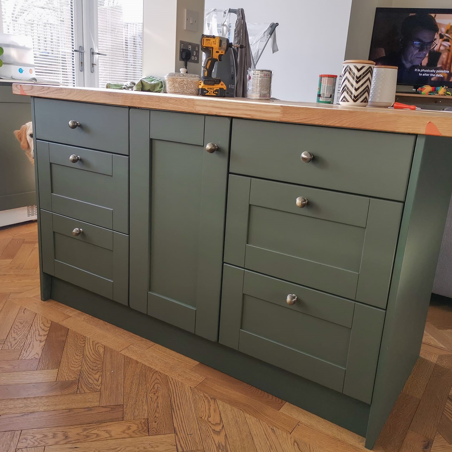
In the picture Irish Dance, from the Trim Paint series.
Imagery and Biophilic interior design
Color images and metaphors – comparisons – often come from nature: grass, forest, moss.
Biophilic interior design is now a popular style among decorators, focusing on nature and naturalness.
Green is a central part of biophilic design, which aims to connect interiors with nature. It is often used in the form of indoor plants, green walls, or nature-inspired decor.
Natural interior design promotes well-being and at the same time brings natural harmony to your home by choosing nature-inspired shades, combining shades with natural, warm surfaces such as brick, clean wood surfaces, and even cork.
Biophilic design creates calm spaces where the mind can rest – just like in nature.
Because we have an innate longing for nature, the solution in the built environment is to bring more nature indoors and into interior design with colors and authentic surface material choices. 
Psychological aspects of green
Imagine a peaceful place – most people think of a place in nature. Green is known to have a calming and relaxing effect, so it suits spaces where peace is desired.
Green is often associated with growth, renewal, and rejuvenation. It can evoke feelings of hope and vitality. Think of the first birch leaves in spring – how bright green they are at first! The shade of the panels in the picture of Apple Barn is a fresh, light garden shed tone.

Positive associations with green
Many people have positive associations with green because it is connected to nature and the outdoors. Nature is known to have a healing effect on the mind – several health benefits can be easily listed: blood pressure and heart rate decrease, sleep quality improves, and anxiety can significantly subside. Dark green spaces and rooms create a safe atmosphere where you can make room for dreams!
Green is a versatile and emotionally resonant color in interior design. It makes green a popular choice for creating refreshing and inviting spaces. Whether used as a dominant color or an accent, green can enhance the overall atmosphere of interiors by promoting a sense of balance and connection to nature.
Green color in home decor
Wall colors: Green wall paint shades can create a sense of calm and connection to nature. Lighter greens can open up a space, while darker greens can add depth and coziness. You add atmosphere, nest-like feeling, and hotel-style glamour by using really dark shades.
Furniture and decor: Green upholstery, furniture, and decorative items can add color and personality to the interior. Green also works well with natural materials like wood and rattan. Paint a half-panel with timeless Jugend green, such as Wise Old Sage in an old house and use cheerful apple green in the garden furniture of a post-war detached house, like the pictured Ikea wooden stool; Apple of My Eye shade.

Retro, traditional and at the same time modern
Earthy and muted green shades, such as olive or moss, have gained popularity for their ability to create grounded and organic aesthetics. Smoky, muted green or teal are now very popular in aesthetic interiors!
Combine with green shades
All muted, earthy tones are safe choices with green. Boldly combine also complementary colors like red and various shades of red such as pink and mauve – or how about yellow?
Try clay gray, terracotta orange, brick shades. Light beige of limestone, terracotta, cocoa brown, or even powdery pink.
Soft natural white and cream shades go well with greens – as do muted blues – think of examples from nature. The matte shades of Frenchic colors are easy and reliable combinations with each other.
Combine green with other natural and authentic surfaces in the decor, such as terracotta pots, brick surfaces, genuine and rough wood surfaces, cork.
Linen, wool, and other textured surfaces pair well with green – as do metal, stone, and glass surfaces.
The human eye loves to look at contrasts, which always make the space a bit more interesting.
In addition to colors, lighting and the use of lights affect the atmosphere of the space. Choose warm tones for a space with little natural light.
Green is often between warm and cool tones - depending on the shade.
For this reason, it is versatile and naturally suitable for most applications.
Remember that you can break all these ‘rules’ and that colors are always a personal experience.
Use boldly the colors you like yourself, so you get the pleasure benefits best in your everyday life!
Find Frenchic's green paint shades
Pastel and cool - like a French pastille, Eye Candy
Cheerful and suitably retro, apple green Apple of My Eye
Moss green Constance Moss
Deep, stunning smaragdine green Victory Lane
Our darkest green, Black Forest
Smoky, trendy eucalyptus, Steaming Green
Camo and a bit army-style Olivia
Light aqua green Breezing
Light gray and green blend Maveric
Grayish sage green Wise Old Sage
Lime green Apple Barn
Heritage shade style Bradstock
Spring green Green With Envy

Also read other color blogs:
Blue colors, Purple

