Color wheel – a help for mixing shades
With a double-sided and large color wheel (diam. approx. 24cm), you can find perfect color pairs and new unique paint mixes for your home's color scheme or for designing color combinations for clothes and art.
What is a color wheel?
The color wheel is a simple tool that shows how colors behave when you add black, white, or a completely different shade. By turning parts of the disc, you see combinations of different shades.
In other words, it quickly shows you which colors go together and lets you see which colors are complementary or tone pairs.
Double-sided color wheel, diameter approx. 24cm – is versatile and easy to use.
The texts on the color wheel are in English.
Read more about mixing colors in the Frenchic Blogs.
Read more on the tab.
How do you use the color wheel?
The color wheel disc has 12 segments – parts, each representing one color. The disc shows how colors relate to each other, whether they are adjacent or diametrically opposite.
The double-sided color wheel contains three primary colors, red, yellow, and blue, as well as three secondary colors, green, orange, and violet (when two primary colors are mixed together, they form a secondary color).
The color wheel also has six tertiary colors, which are mixtures of primary and secondary colors. These are red-orange, yellow-orange, yellow-green, blue-green, blue-violet, and red-violet.
Warm colors - reds, yellows, and pinks - are on one side. Cooler shades - blues, greens, and violets - are on the opposite side of the wheel.
Choose a color, for example green – then turn the inner wheel of the color wheel to see what it looks like when you add red to the green you chose. Turn more and you will see what green looks like when you add yellow to it, etc.
Turn the color wheel and look at the green color. Align the inner disc of the wheel with green, and you will see three shades of green in the inner disc view: Shade, Tone, and Tint – marked accordingly.
Shade: your chosen color + white
Tone: your chosen color + gray
Tint: your chosen color + black
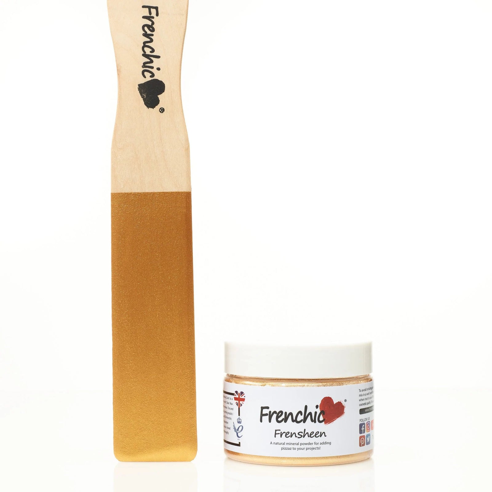
Our Frenchic customers have skillfully mixed their own unique shades, which you can find in the FB group with the keyword COLOR RECIPE. Join the group here!
How to create functional color combinations for home decor using the color wheel?
Using the color wheel to build a color scheme also requires understanding different types of color schemes from the perspective of home decor ideas. Examine the shades with the color wheel, together with color theory, without forgetting your own preferences.
The color wheel is just your helper, but trust your own opinion and use shades you like yourself. However, the color wheel can be very practically useful whether you're planning large compositions or considering making a single beautiful shade mix.
Mixing colors is fun, and by mixing your own shades, you can find completely unique and personal tones to use!
A diligent shade mixer and painter always keeps white and black paint on the shelf, because with their help you can mix countless shade combinations that still match beautifully – a good tip for renovation and interior painters!
Monochromatic color schemes
Monochromatic color schemes create a harmonious, calm atmosphere, which is currently very trendy in interior painting. Right now, it is trendy to paint the ceiling and trims in the same or almost the same shade as the walls.
You can choose one main color, for example blue, and use different shades of blue on surfaces and in decor, from very light, bright, greenish-blue to navy blue depending on the room and desired atmosphere.
Read interesting and useful Frenchic Blogs about the latest interior design trends!
Complementary colors for the bold
The contrasting color scheme uses two colors from opposite sides of the color wheel. For example, how would orange and blue look together – you can also use this trick on a small scale – for example: paint a wall blue and use an orange lamp in the decor in front of the blue wall.
Complementary colors are also pleasing to the eye.
Which colors go well together in interior design?
If you follow the color wheel, you'll find a wide range of shade options to choose from. Some of these combinations may already be familiar to you, while others you might not have encountered before.
Here are some successful combinations worth considering:
Yellow and green - Hot as Mustard and Constance Moss
Green and natural white - Green With Envy and Parchment
Blue and red - Hornblower and Rubina
Blue and green - Ol' Blue Eyes and Wise Old Sage
Blue and orange - Ol' Blue Eyes and Earthy
Blue and light pink Kiss Me Slowly and Dusky Blush
Green and light pink
Play with shades and the intensity of shades
A good tip is to use different saturation levels of a color. We recommend using a lighter shade of one color and a darker shade of another. For example: Green and light pink.
Use darker green and light pink together – a guaranteed winning pair! This combination is also complemented by raspberry red and fuchsia as accents. Finish the space with a light blue floor. Do you notice that this foolproof combination looks like it came straight from nature!
Green is currently trending in interior design.You can naturally combine green with all nature's shades: blue, brown, terracotta, beige, and black – along with their various gradations.
Think of the sky – sea and earth. With these shades, you can create a cozy and natural calm background for the rest of your home's interior.
You can be bold with natural shades – try water tones, deep forest green, and fresh sky blue.
Combine green with a soft cream shade instead of white if you want soft tones.
What pairs well with gray?
Gray is still popular in interior design; you can pair gray with lively terracotta, blues, and various reds. Spicy shades of browns and yellows also suit gray well.
Now that you have a bit more information on how to use the double-sided color wheel and how colors are mixed, you'll surely get inspired to create your own perfect palettes! You can conveniently access the shades directly from here.